Chart types on this page:
Column chart
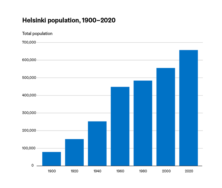
The column or vertical bar chart (Column chart in Excel) is used especially for time series, but occasionally also for other data on a continuum. The variable on the horizontal axis must therefore form a series with a unique order: in addition to a time series, for example, age groups or income classes can form such a continuum.
If the x-axis variable does not form a continuum, the horizontal bar chart is a more suitable chart choice.
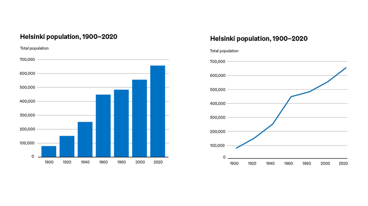
The line chart can be an alternative to the column chart in most cases. Between the two, a column chart gives more emphasis to the individual values as well as the comparison between them, whereas a line chart emphasises the direction and speed of change in the data.
The column chart axis should never be truncated.
Horizontal bar chart
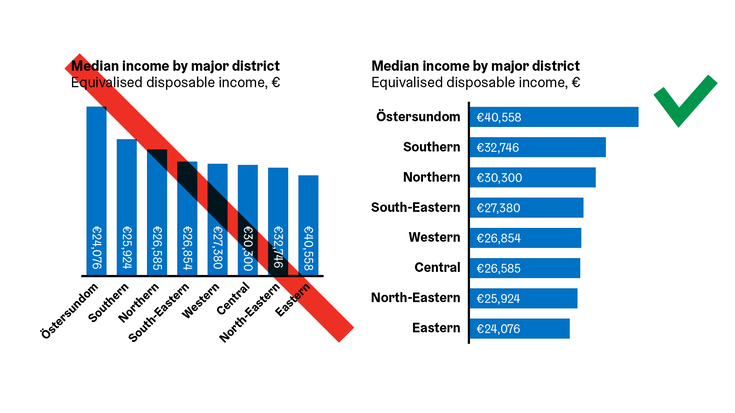
The horizontal bar chart and the vertical column chart are used for two completely different purposes, and are not suitable for visualising the same dataset. Horizontal bar charts (Bar chart in Excel) are used when the variable at hand is categorical, that is to say that it does not form a continuum.
The main reason is that categorical data requires usually quite long labels, and the horizontal bar chart allows for easy placement horizontally next to the bar element. On the other hand, a vertical column chart would require long title blocks to be rotated at a 45 or 90 degree angles (never recommended), which significantly reduces the readability of the chart.
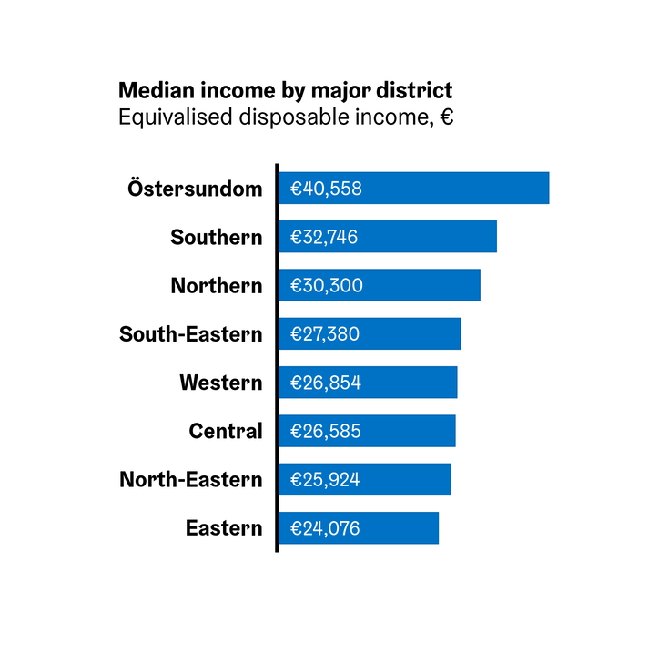
The bars in a horizontal bar chart are usually arranged in order of magnitude from largest to smallest, but other arrangements based on the data may also be justified.
A bar chart axis should never be truncated.
Clustered bar/column chart
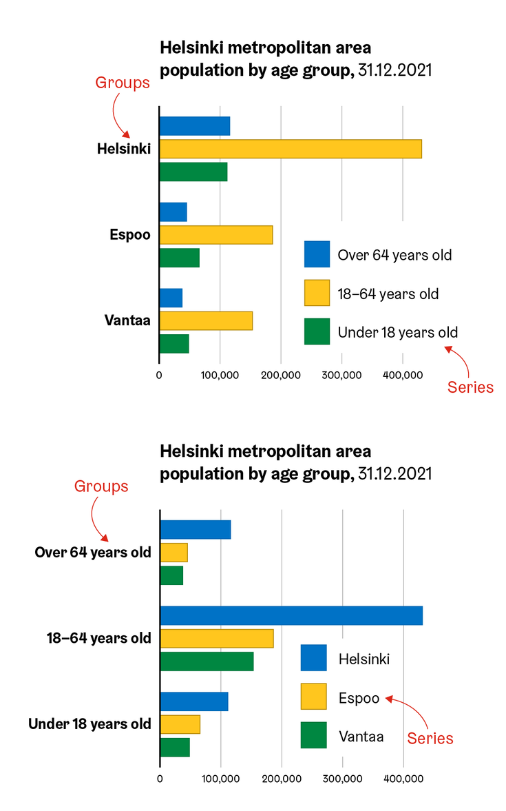
Both bar and column charts can showcase several parallel bars belonging to the same category, in which case it is called a clustered chart.
The bar elements in a clustered chart can be laid out in one of two ways: columns belonging to the same category which are separated from each other by colour are called series, while groupings of columns belonging to different categories but the same series are called groups.
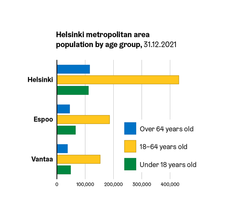
The impression of the data given by the clustered bar/column chart is dependent on which of the two classifications is designated as series, and which as groups. In the image on the left, age groups are shown as series and cities as groups. On the right the opposite arrangement is used.
As a rule of thumb, there should be no more than three series in a clustered bar/column chart, as more than this tends to make the visual difficult to read. If more series than this are needed, it is recommended to use another chart type, for example the small multiples display.
Stacked and 100% stacked bar/column charts
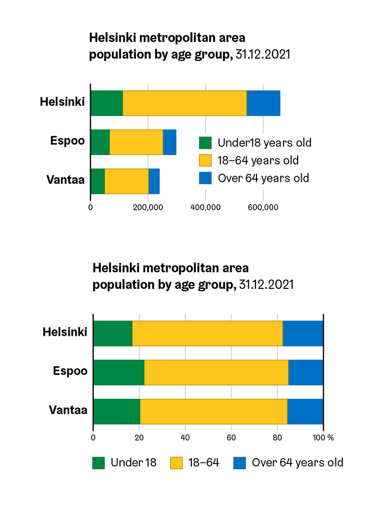
The stacked bar chart is a vertical column or horizontal bar chart in which bar sections are shown stacked on top of each other. In a 100% stacked version the series represent the percentage distribution and each whole column, and the sum total is always 100%.
As in the clustered bar/column chart, bars of the same category separated by colour are called series in a stacked chart. In turn, groups are the whole columns of stacked sections. Thus, parts of columns belonging to the same group are shown stacked on top of each other.
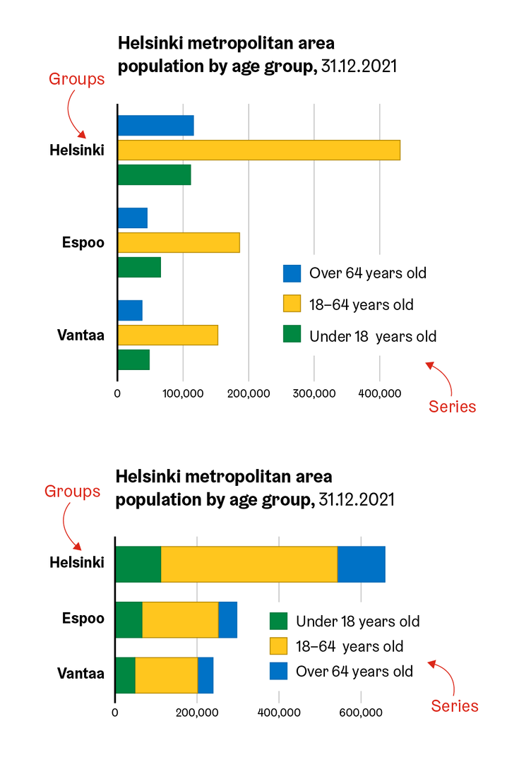
The stacked column/bar chart and the clustered chart variant are alternatives to each other: the stacked chart emphasises the total amounts and the comparison between each, while the clustered chart focuses on the comparison between individual data points.
The 100% stacked chart is recommended when the aim is to compare the distribution of data points between different datasets, as the visual comparison of pie charts, which are commonly used to represent distributions, is rather difficult.
Pictorial unit chart
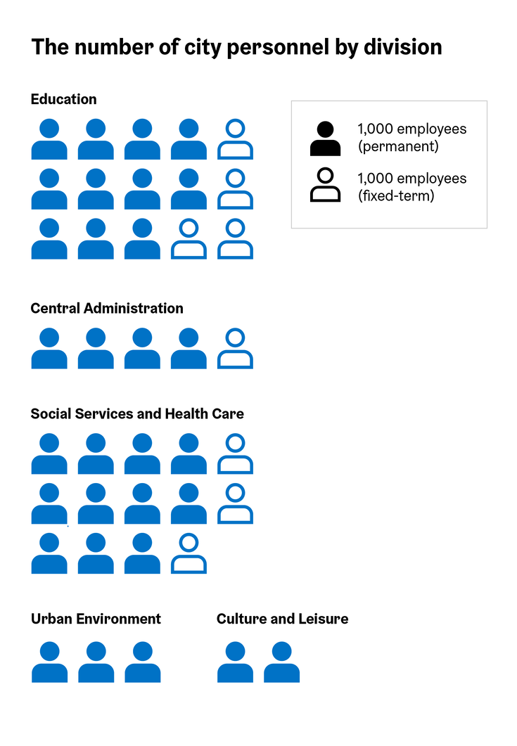
The pictorial unit chart is a good choice when the numbers to be compared are small integers, or when it is not necessary to compare exact values. It visualises a numerical value by selecting an appropriate base unit, denoted by a pictogram or icon, or an abstract symbol such as a circle, which is repeated the required number of times. Several icon libraries have been produced for the city(Link leads to external service), including many pictorgrams that may be used for these charts.
The pictorial unit chart is considered easy to understand even for readers who are not particlarly versed in reading visualisations. It is therefore often preferred when the target audience is ordinary citizens rather than experts.
The downsides of this chart type include inevitable inaccuracy due to rounding errors, and the fact that the chart cannot be generated automatically, for example using Excel, and usually requires input from a designer.
Line chart
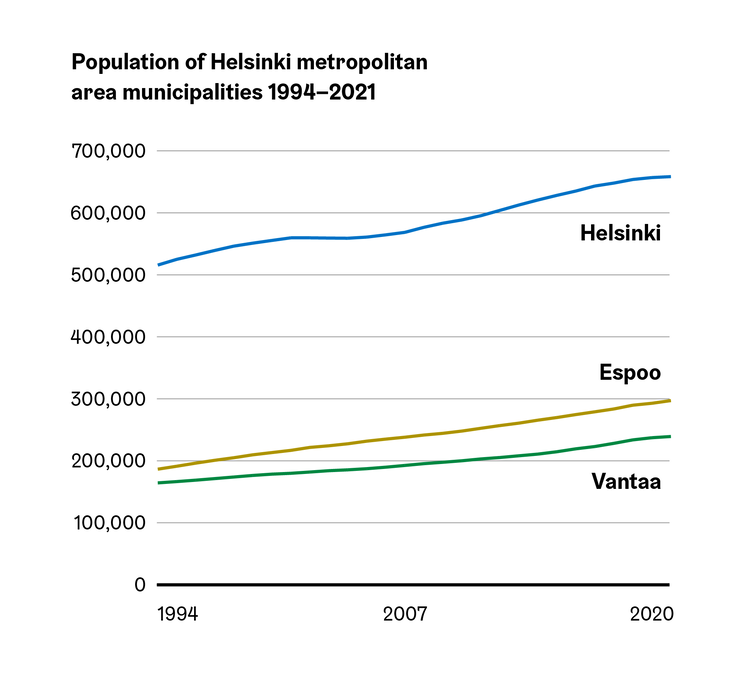
The line chart is used for the same purposes as the vertical column chart: primarily to show time series, but sometimes also some other data on a continuum. The variable on the horizontal axis must therefore form a sequence with a unique order: in addition to a time series, age groups or income classes, for example, form such a continuum. If the variable does not form a continuum, the line chart should not be used under any circumstances.
In most cases, a line chart can be used for the same data as a vertical column chart. Compared to a line chart, a column chart puts more emphasis on the values of individual data points and the comparison between them, whereas a line chart emphasises the direction and speed of change.
Marked line chart
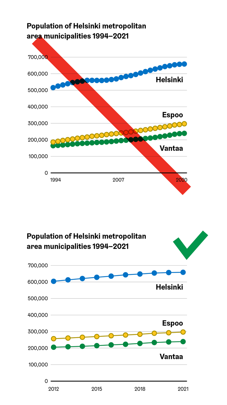
The line chart can also be drawn with marker symbols, in which case each data point in the series is denoted with a series marker. The labels help compare the exact values of the data points, so a marked line chart can be considered as a combination of the best features of a vertical column chart and a line chart.
However, markers are only helpful in interpreting the line chart if they are reasonably few in number. If there are so many symbols that they make it difficult to see the shape of the underlying line, it is better to draw the line chart as a normal, unmarked version. Even then though, the first and last points of each series may be marked with a symbol, if desired.
In the images on the left, there are so many markers that they completely cover the line itself, making it difficult, if not impossible, to read the chart. In the right-hand figure, the markers do not prevent the line shape from being detected, but do help in reading the values of the individual data points.
Slope graph
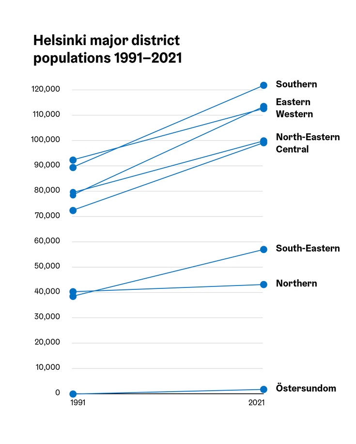
A special case of a line chart is a slope graph, where only the start and end points of each series are shown. In this case, the lines in the chart are all straight, making it very easy to compare their slopes.
The slope chart works well when there is limited space for the chart, or when you want to compare a larger number of series than usual at once. In this case, instead of using a separate colour for each, the lines are labeled directly at the end of each series, as it is very difficult to find more than six reliably distinguishable colours.
Stacked area chart
An area chart shows the distribution of a whole into parts, as well as the change in this distribution over time. It resembles a line chart where the areas between the series lines and the baseline are coloured in. The series are stacked on top of each other, usually in such an order that the series with the least variation are at the bottom, and the series with the most variation are at the top.
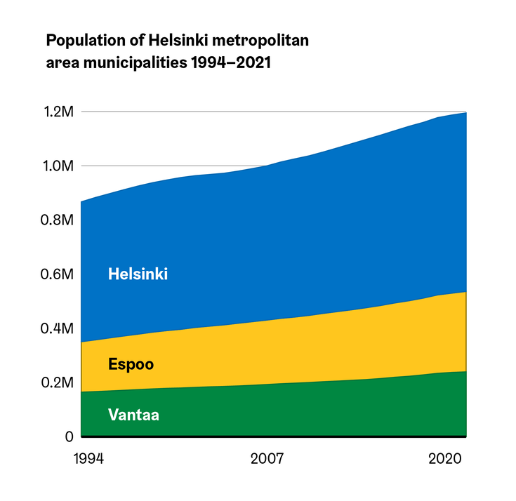
Unfortunately, many programs, e.g. Excel, also allow the creation of a non-stacked area chart, where each series starts from zero, like in a line chart. This type of chart should never be used, as the coloured areas give the reader the false impression that the series in the chart are stacked on top of each other, and that the chart represents the division of the whole into parts.
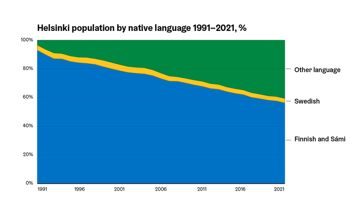
The stacked area chart can also be used like the 100% stacked column/bar chart, where the sum of the series is always one hundred percent.
Small multiples
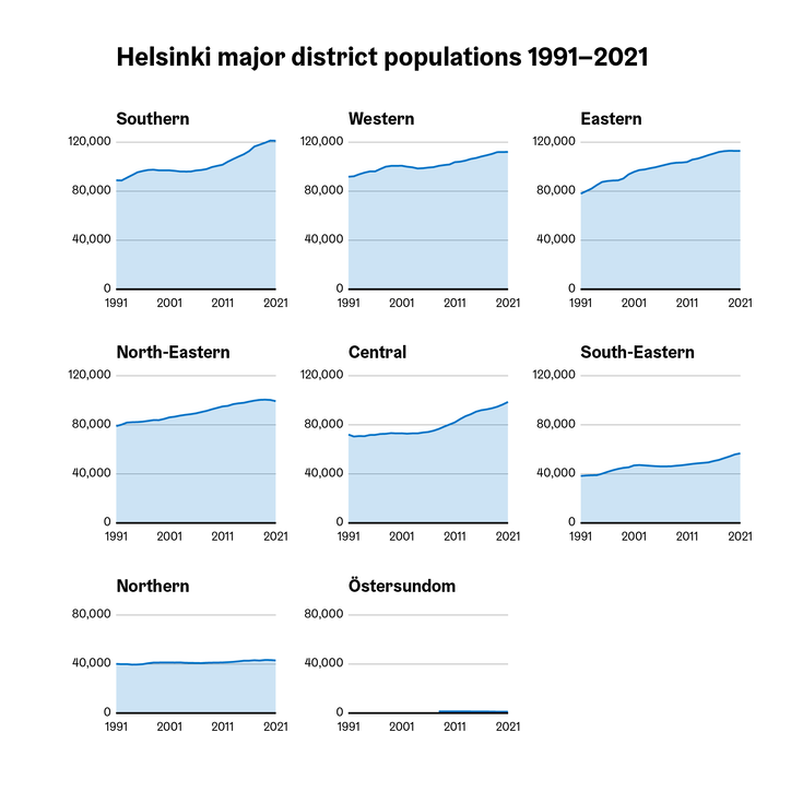
A small multiples display is not really its own chart type, but a matrix consisting of several small charts using consistent axis scales and following the same design principles. Most commonly you will see a small multiples display of line charts with the area below the line coloured with a translucent fill colour, but in principle almost any simple statistical chart type, and many maps, can be used as the basis for this matrix.
In a small multiples display, eye movement between the visualisation parts is effortless, compared to layouts where the charts are presented completely separately. Furthermore the small multiples format is also much easier to read than a large number of series crammed into a single chart. It is therefore often a good alternative to other types of charts when more than 6 series are to be displayed simultaneously.
Pie and donut chart
Pie and donut charts (Doughnut chart in Excel) are familiar ways for readers to visualise the division of a whole into parts. They differ only aesthetically. Studies have found no differences in how these charts are read – with the exception of donut charts where the ring is very thin, and therefore difficult to read (a functional thickness for the ring portion of a donut is usually about 1/6 of the diameter of the chart itself, with the width of the hole in the middle of the chart being 2/3 of the width of the whole chart).
Pie and donut charts should always have a sum total of one hundred percent. They are not very well suited to comparing multiple percentage distributions, and the 100% stacked bar/column chart is a better alternative for this purpose.
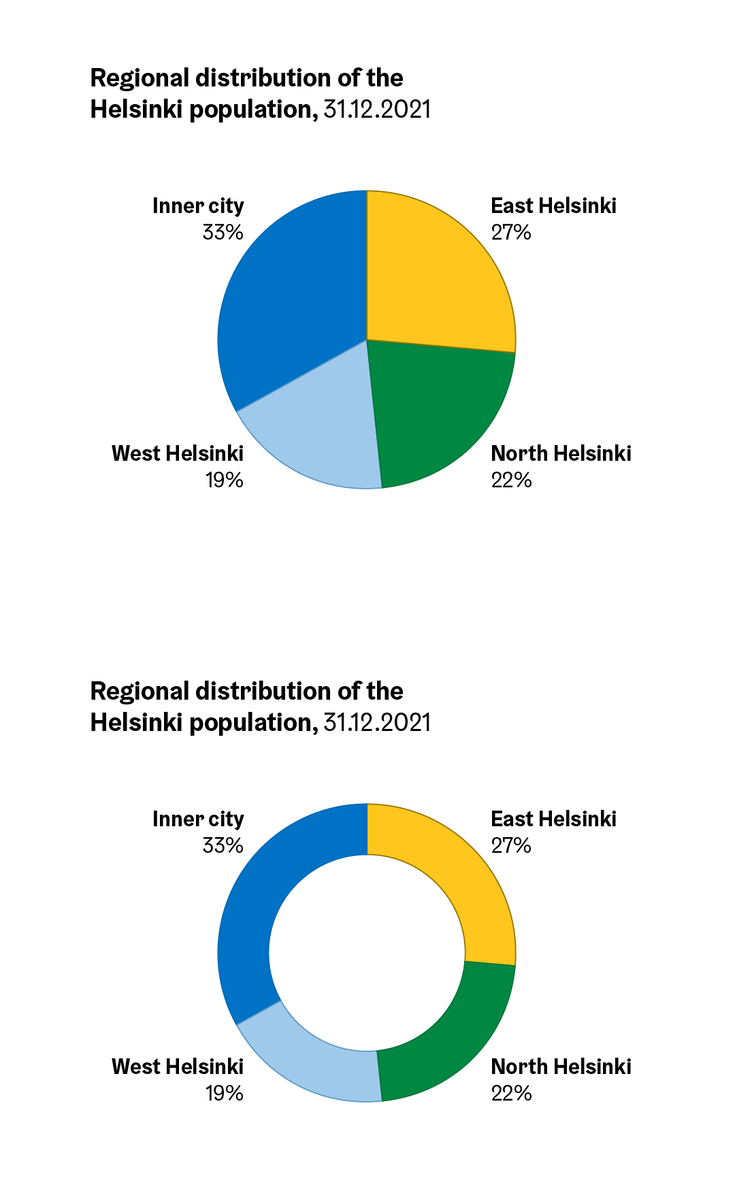
The chart must always be exactly circular, as the visual interpretation of pie and donut charts is based on the assessment of area. If the chart is of any other shape, any slices representing the same percentage may be completely different visual shapes and sizes in different parts of the chart. For the same reason donut charts with nested rings are not recommended, as the smaller diameter of the inner rings will inherently result in smaller slices than ones on the outer ring of equal value.
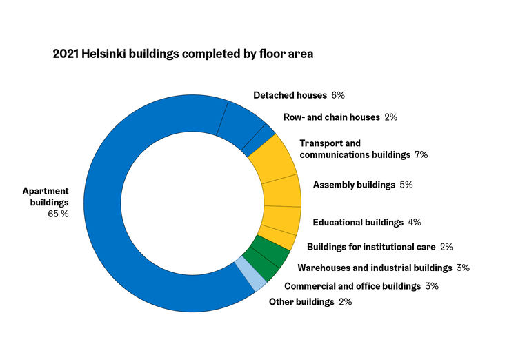
The maximum number of slices recommended for a pie chart is usually 6-7. A slightly higher number may be considered if the slices can be arranged into groups by category, such as in the example below.
Bar-of-pie chart
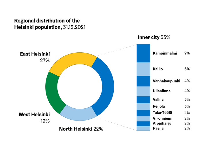
In a situation where a pie or donut chart would include significantly more than 6-7 slices, or if a single slice’s inherent subparts need to be highlighted separately, the chart can be supplemented with an adjacent stacked column chart (this is its own chart type in Excel, albeit of the same name bar of pie).
When partitioning a pie chart in this way, one (or less often, two) of the pie slices is opened to the side as a stacked column chart. Lines are drawn from the edges of the opening slice to the edges of the column to show the connection between them.
Treemap
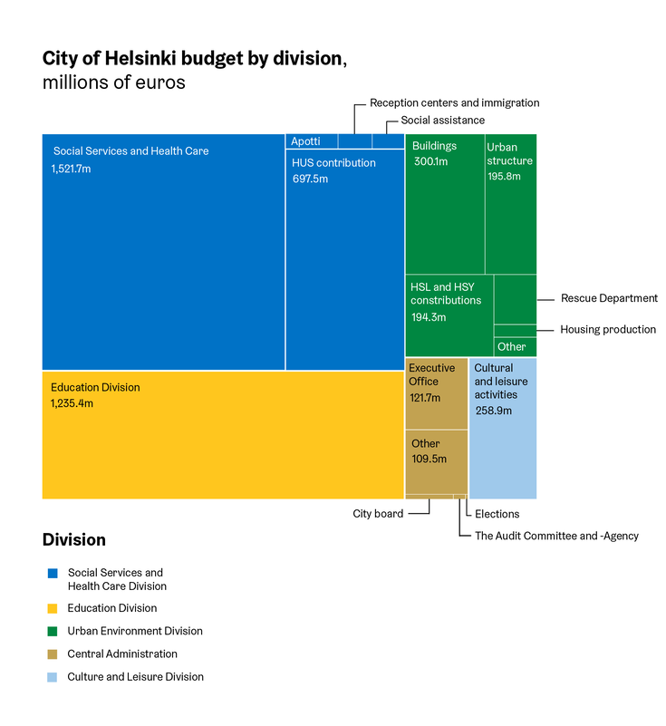
Like pie charts and 100% stacked column charts, the treemap shows the division of a whole into parts. The chart is composed of a rectangle, within which are drawn other rectangles of varying sizes and colours. The colour and grouping of these pieces within impart information about their hierarchy and tree-like content structure.
Treemaps are most often used to show the breakdown of budgets, but it can also be used for showing other hierarchical material. It is a good alternative when there are more pieces and hierarchical levels than would fit nicely into a pie or stacked column chart.
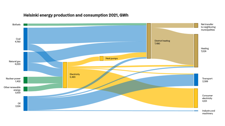
Flow chart / Sankey diagram
The flow chart (also known as a Sankey diagram) is also used to show the hierarchical division of a whole into parts. Like the treemap, it can be used to show budget breakdowns, among other things. It is especially suitable for applications where it is possible to identify a clear direction of flow, e.g. expenditure and income, immigration and emigration, or production and consumption.
The flow chart can also be drawn on a map canvas, in which case it is called a flow map.
Choropleth map
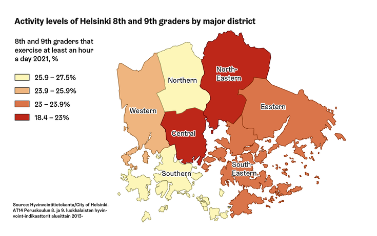
The choropleth map is the most used of the data map types. It is based on a predefined areal unit, such as municipalities or postal codes, which are then coloured according to a variable of interest. Choropleth maps are most often used to show numerical values, but it is also suited for showing qualitative data, such as in the example below.
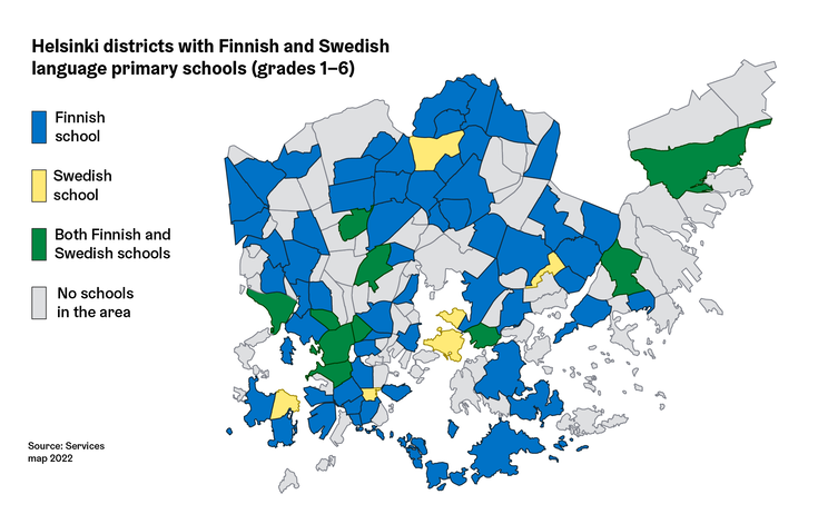
If numerical data is used on the choropleth map, make sure to use relative values, e.g. percentages or, for example, residents per km2. The reason for this is that the areas of the choropleth map are often of very different sizes: for example the population of Östersundom district is less than 2%. Absolute comparisons between areas of completely different sizes produces misleading results, but the use of proportional numbers allows for more meaningful comparisons.
When a choropleth map uses a quantitative colour scale, values should be classified into 3-7 categories, instead of a continuous scale where each possible numerical value gets its own colour tone. The most commonly used classification method is the quantile principle, where class boundaries are formed so that approximately the same number of objects would fall into each category.
Dot or proportional symbol map
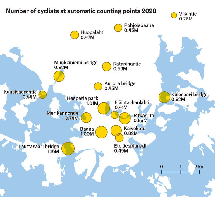
A dot or proportional symbol map is used to show the geographical distribution of a phenomenon of interest. Symbols are placed on the map – usually circles –, which show the objects of the map, i.e. locations of data points whose symbols are scaled according to value. These data points can be schools for example, in which case the area of the symbol can describe the number of students, or traffic counting points, as in the example below.
Symbol size scaling should be based on their surface area and not on the diameter, i.e. if the value of A is twice that of B, A’s area representing the value must be twice that of B. Note that if the diameter of A were double with respect to B, the surface area of the circle would in turn be quadruple, which would greatly exaggerate the size difference between the objects! (there is also an alternative to the surface area scaling, the so-called Flannery’s method(Link leads to external service), which tends to compensate for people’s tendency to slightly underestimate area differences.)
Since data points that are close to each other may partly cover each other, symbols often use a translucent fill colour or just a plain outline.
A symbol map with all symbols of the same size – i.e. their size does not encode information – is called a dot map.
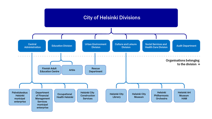
Organisational chart
An organisation chart is used to present hierarchical information about a company, or the central command relationships of the various actors in an organisation. It is one of the most famous tree-type charts.
The same chart type can be used for showing data structures, for example.
Process diagram
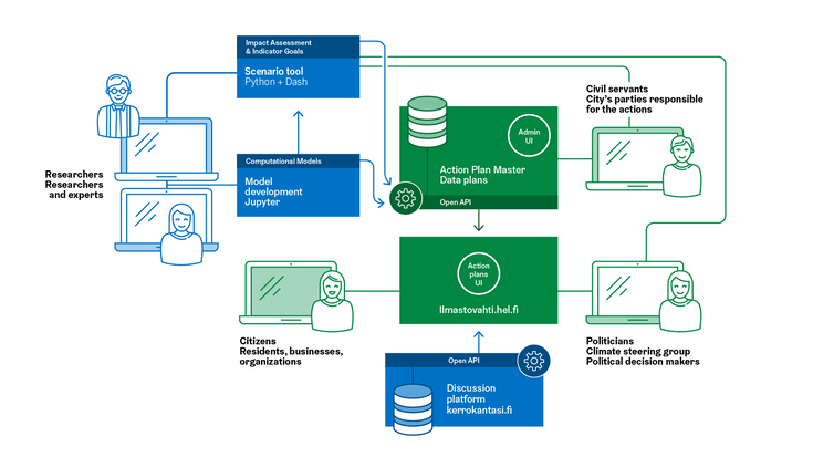
Like the organisation chart, process diagrams are also tree-like charts that describe hierarchical relationships. They are used to show the different stages of a project or decision process, as well as the actors involved within.
The process described in the diagram has flow direction indicated by arrows, as well as clear beginning and end points, even if the process is cyclical in nature. The process can also branch out, or contain feedback elements that go against the main direction of flow.
Timeline
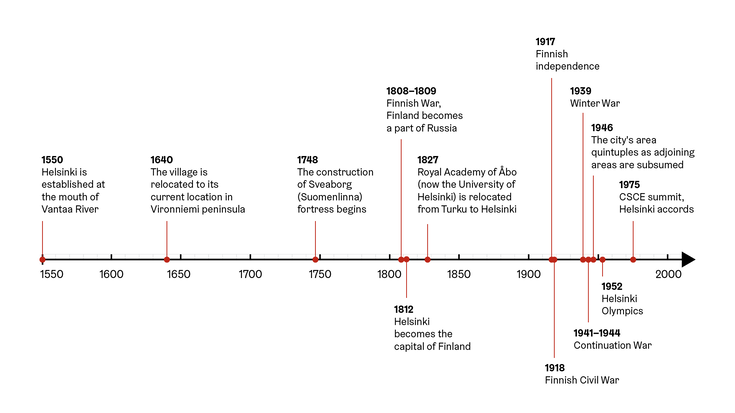
A timeline shows the temporal sequence and rhythm of past or future events, as well as the simultaneous development of parallel events. Events can be singular or continuous, and there can also be overlaps between them.
Different timelines are used, for example, for mapping historical events, general project management, or for communicating progress information about large projects such as street works.
A good timeline shows not only the order of things – which can be just as easily summarized with bullet points –, but also includes their rhythm. This means that the events placed on the timeline are visually spaced according to the their temporal distance from each other.
