The most appropriate visualisation method for each purpose depends on the nature of the data to be displayed, the number of series and data points to be compared, and the features of the data to be highlighted, along with other case-specific considerations.
The most common uses of visualisations are:
Comparison of numerical values
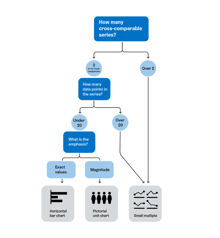
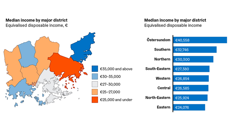
One of the most common uses of visualisations is the quantitative comparison of numerical values. The figures to be compared can be numbers of units (e.g. numbers of people) or quantities (e.g. surface areas). When there is no temporal or hierarchical dimension to the comparison, it can be referred to as categorical comparison – the items to be compared are in different categories (e.g. individual municipality districts or different sectors). The most commonly used chart type for categorical comparison is the horizontal bar chart. An alternative visualisation is the pictorial unit chart, which is well suited in cases where the figures to be compared are small integers or when it is not necessary to compare exact values.
If you want to include several series in the comparison (see groups and series) – for example, if you want to show the population of the city subdivided into groups by both age and language – it is worth considering a small multiples display as an alternative, especially if there are a large number of series.
Change over time
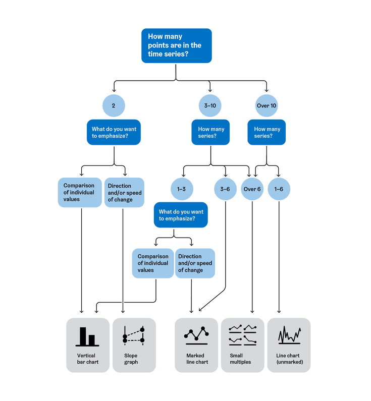
One of the most common uses of visualisations is to show change over time. For this purpose, marked or unmarked line charts, vertical column charts or slope graphs may be used. The choice of chart depends on the number of series and the number of data points therein, as well as what you would like to particularly highlight in your visualisation.
When temporal variation is combined with the comparison of parts of a whole, a stacked area chart is preferred.
If there are a significant number of series to be compared, it is advisable to consider using a small multiples display.
Parts of a whole
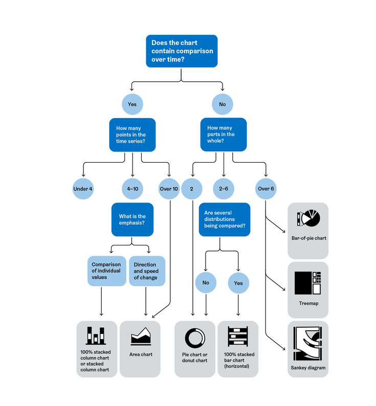
A third common use of visualisations is to divide a whole into parts. The most common way to do this is to use a pie or donut chart. However, pie and donut charts are poorly suited for comparing distributions. If the chart includes a comparison, it is recommended to use the 100% stacked column chart instead. For temporal comparisons a stacked column chart and a stacked area chart are suitable.
If the whole is composed of more than 6 parts, it is recommended to use one of the following other chart types. Suitable alternatives include the bar-of-pie chart, the treemap, which is particularly good for illustrating budgets, as well as the flowchart.
The sum of the parts of the whole is always 100%
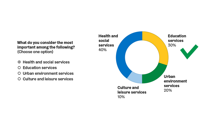
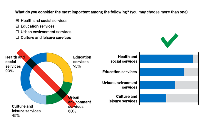
When using the above chart types, make sure that the material being visualised is indeed clearly a whole: for example, the sum of the slices of a pie chart must always equal 100%. If this condition is not met – for instance when showing the distribution of answers to multiple-choice questions where it is possible to choose more than one option – it is not a comparison of parts within the whole, but rather of numerical value comparison, and the presentation methods mentioned here are not fitting.
If in a multiple-choice question only one option is possible, the answers to this question form a whole whose sum is 100%. It is therefore suitable for visualisation as a pie or donut chart.
If a multiple-choice question allows several simultaneous answers, these answers do not form a whole whose sum equals 100%. This type of data is cannot be visualised in a pie or donut chart. Instead, the proportion of respondents who have chosen each individual response option can be treated as a parts which add up to a whole in a 100% stacked bar chart.
Areal comparison
The most commonly used map types for areal comparison are:
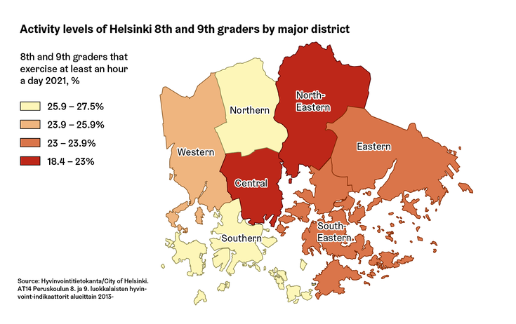
The choropleth map is a map based on existing regional divisions (e.g. postal codes or municipal districts). The regions are coloured according to the values of the variable of interest. Choropleth maps should always use relative data (e.g. % of the population, residents/km2, €/resident etc.).
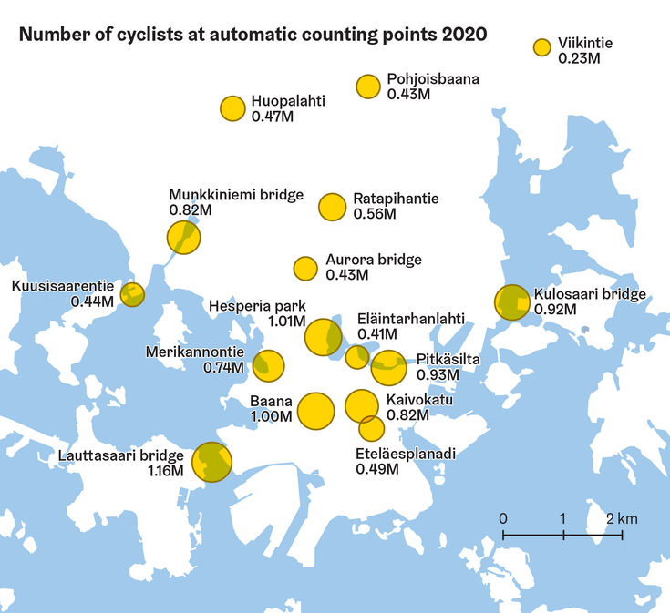
The dot or proportional symbol map is a map where the values of the variable of interest are presented by symbols of different sizes. The dot map can be used to represent not only areas (e.g. values by municipalities), but also point locations (e.g. store locations). The dot map should use only absolute values (e.g. number of persons or euros), and should have a base map that does not distract from visually comparing the symbols used therein. If the number of data points is not too many, their values can be labeled on the map as well.
This symbol map has the simplest possible base map: only the sea areas are shown. Each symbol is labeled with its name and value.
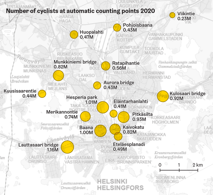
The dot map can also use the city’s predefined base maps. For example the grey base map of the Helsinki metropolitan area (map series_pks_grey) is a suitable alternative.
If no clear geographical pattern is discernible in the data, or if the spatial resolution of the data is very coarse, a map may not be the best tool for showcasing your data, but rather a simple horizontal bar chart might work better.
For example, a map that uses the larger Helsinki metropolitan areal divisions may not reveal any interesting features of the phenomenon at hand. The bar chart is much easier to make than a map, and allows for a visualisation of precise values which is not possible with a choropleth map.
Visualising individual numerical values
Most forms of infographics are based on the visual comparison of related values, or otherwise related content. Occasionally, however, it is necessary to highlight individual figures or other facts of interest without a particular point of comparison.
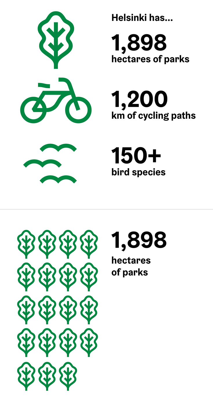
There are two common ways to do this. The first is a so-called big numbers visualisation, where numbers (or other facts) are described by typographical means. In this case, key points such as numerical values are usually set in a larger font size, and the supporting information such as units of measurement are set in smaller type. It is also common to use pictograms, i.e. icons, in order to quickly identify the subject matter to which the information relates.
Another option is to use pictograms as unit symbols. This visualises a numerical value using an appropriate base unit, combined with an icon or an abstract symbol such as a circle, which is then repeated the required number of times. In the above example, 100 hectares is chosen as the unit, and the corresponding pictogram is repeated 19 times (since 1,898 hectares rounded to the nearest hundredth is 19 × 100).
The city has produced several image libraries(Link leads to external service), with pictograms that can be used as unit symbols.
Qualitative data
In addition to just numerical data, visualisations can also show qualitative information such as processes and hierarchies. The field of qualitative infographics is diverse, and the chosen visualisation type is not necessarily always widely known or established – that is to say, sometimes the qualitative infographic may be completely unique.
Below are a few commonly used ways of presenting qualitative data:
Tools to help you choose a presentation format
If you can’t find the answer to your chart choice conundrum in this guide, you can also try the following commonly used tools: